When you think of 404 pages you probably think of a really low-key, uninteresting default page that says “404 error” with a “back to home” button and very little else. (Or maybe it’s so boring that you haven’t even thought about it before.) But the hidden truth is that they can be a great touchpoint in the customer journey and reflect your personality way better than a boring error page would – and yes we have some 404 page examples for you.
I asked Amy Walters from Bloomify Design to break down with us what makes a great 404 page.
In this breakdown we’ll share with you:
- Why 404 pages matter (beyond “oops, broken link”)
- Examples of brands doing it brilliantly
- What a marketing-friendly 404 needs to include
- Common mistakes to avoid
- Practical tips to create your own
Why 404 Pages Matter
What if a 404 page could be a place of fun and creativity that draws your audience in further rather than pushing them away?
What if you could turn an “oops” into an opportunity?
As well as being able to reflect your brand voice, add visible branding, and show a bit more personality, 404s can be an SEO nugget too.
While it doesn’t directly impact your SEO rankings (sadly Google doesn’t give points for “the most fun” error pages), it does indirectly help SEO in a few key ways:
- Lower bounce rate and better engagement: If someone hits a dead link and instantly leaves, that’s a lost opportunity. A creative 404 that guides them to useful content (blog posts, shop categories, search, etc.) can keep them on your site browsing happily.
- Improved user signals: Time on site, pages per session, and return visits are all positive engagement metrics that search engines notice.
- Reduced crawl issues → If you provide helpful links and structure, search engine crawlers can more easily navigate back to important pages.
- Brand trust and authority → People who enjoy the experience on your website are more likely to remember, return, link back, or share your site. Those things do directly impact SEO.
A great 404 page is not a replacement for fixing broken links. It is a way to reduce frustration and keep people moving.
What a 404 should do:
- Confirm they’re in the right place (even though the page is missing)
- Give them a simple next step
- Offer a few relevant routes back into your site
- Make the experience feel on-brand
What a 404 should not do:
- Pretend the missing page exists
- Hide broken links instead of fixing them
- Overwhelm people with 20 choices
- Make the user feel like it’s their fault
The goal is always to guide users back on track, while making them remember you, and smile along the way.
The Anatomy of a Creative 404 Page
So what actually makes a good 404 page work?
With everything in business, you want to make sure that what you’re creating reflects who you are, your values, your personality and your visual branding. That looks like clear on-brand messaging with your logo, colours and design working together.
- Clear message: Let them know they’re lost, but it’s ok, you’re going to help them find their way back on track.
- Branding and voice: Keep it consistent with your brand personality. If everything else about your messaging is flamboyant and fun, match your 404 to flamboyant and fun. If you’re more calming and low-key, match your 404 to calming and low-key.
- Navigation: Give them clear signs to get them back on track with ways to get to your homepage, your search bar, popular links or specific pointers to individual pages.
- Personality boost: This is where you can get creative, whilst matching your messaging. Games, humour, imagery, interactivity, music and media… the possibilities are endless.
Minimum viable 404 (if you do nothing else):
- A clear headline (Page not found, but make it you)
- A short explanation (one sentence)
- One primary CTA (Back to home, Search, Browse)
- 3–6 helpful links (popular content, key categories, contact)
Nice-to-haves (if it fits your brand):
- Animation or a GIF
- A mini interactive element (quiz, choose-your-own-adventure, puzzle)
- A tiny easter egg for superfans
- A personalised suggestion (“Most people who land here are looking for…”) if your site supports it
How your 404 page looks depends entirely on who you are as a business and what you’re trying to achieve. A funeral director probably wouldn’t have a game 404 page, but it might have a “thought for the day” one.
Tailor your oops into the opportunity to showcase more of who you are.
Lego 404 Page
Their 404 shows a little Lego figure with a broken link.
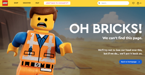
Why this works:
- The wording is family-friendly, with creative wordplay for “oops” (oh bricks!).
- They pair it with a high-quality image that brings their product to life.
- Users get a clear route back home via a high-contrast button.
- The global navigation stays visible, including the search bar.
It’s a fun moment in what otherwise could’ve been a frustrating lost-page experience.
Airbnb 404 Page
Uses a moving whimsical illustration of someone dropping their ice cream, with simple navigation.
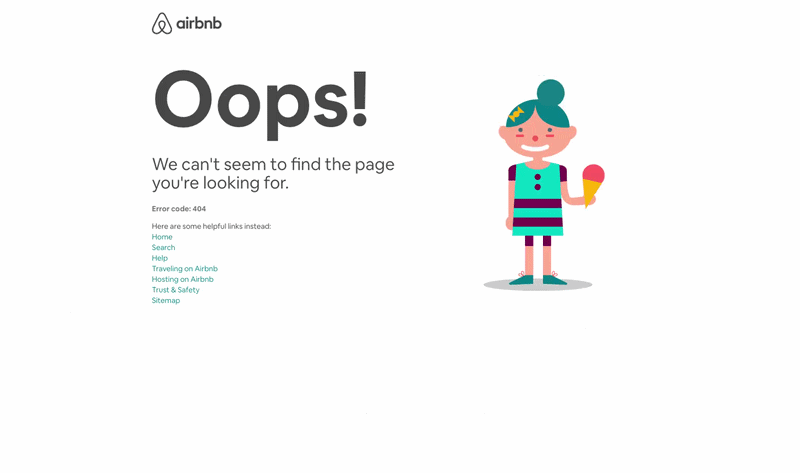
Why this works:
- They’ve taken a common holiday “oops” (dropping your ice cream) and made it feel human.
- Instead of only pointing users “back to home”, they share top links someone might be looking for.
- They include a catch-all sitemap link to help people find anything else.
They’re enticing users back into the website.
Pixar 404 Page
Ties in characters like Anxiety from Inside Out with a simple “back to headquarters” link.
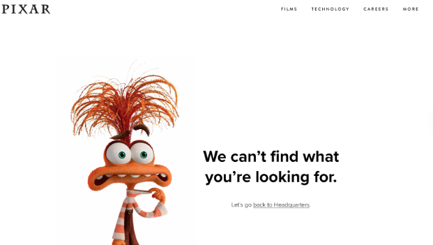
Why this works:
- Fans recognise the character instantly.
- Pixar plays into the character’s personality, showing they care you landed on the wrong page.
- The standard navigation stays at the top.
- Minimal, on-brand copy points users “back to headquarters” (home).
Outgrow 404 Page
Outgrow has an interactive quiz to find out where you want to be sent next.
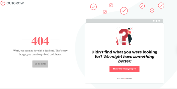
Why this works:
- Outgrow’s product is quizzes, calculators, and forms, and they use that strength on their 404.
- Users get two options: go back home, or use the quiz to find the right product/page.
- It demonstrates what they offer, shows off the branding, and reduces bounce.
Pressure Point Escape Rooms 404 Page
Pressure Point Escape Rooms challenge you to solve your way out.
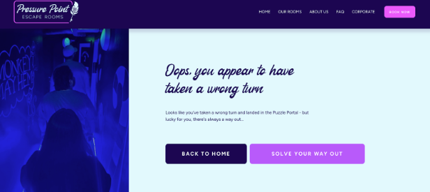
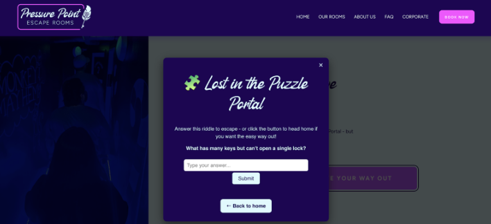
Why this works:
- People can take the easy way out (back to home), or solve the puzzle.
- It speaks directly to their ideal audience: escape room enthusiasts.
- It strengthens the connection through personality.
- It can cleverly prompt users to book once they get the answer correct (right when they’re feeling proud).
Whatever you choose, make it you.
Marketing Opportunities Hidden in 404s
There are plenty of hidden marketing opportunities in your “oops” page.
Not only do you get to build your brand personality and reinforce your brand story by creating a memorable experience instead of frustrations, you can also offer some kind of action.
Turn the “dead-end” into a client lead with a straight path to your offers.
- Capture leads: newsletter sign-up, freebie download, quiz opt-in
- Drive revenue: highlight a key offer, link to booking, add a “start here” product path
- Reduce bounce: your top 3 pages, top 3 categories, search bar front and centre
- Build brand love: humour, easter egg, “send us what you were looking for” prompt, UGC invite
How to Create Your Own Creative 404 Page
So how can you create your own creative 404?
Work with your designer to make it feel like you. If you’re DIY-ing it, remember to keep things simple, balanced, use white space to your advantage, and most importantly make sure it looks on-brand.
- Add navigation back to key areas (products, blog, contact).
- Use humour or storytelling that fits your tone.
- Consider interactive elements (mini-games, quizzes, GIFs).
- Track performance (bounce rates, clicks from 404s).
Your 404 Checklist
Experience:
- Does it clearly tell people what happened?
- Does it include clear navigation back to key areas?
- Does it feel on-brand (voice and visuals)?
- Does it have sprinkles of humour, creativity, and humanity?
Marketing:
- Does it offer a next step or call-to-action (opt-in, content, shop, contact)?
- Are you tracking performance with analytics?
- Do you know what success looks like (lower bounce, more clicks, more sign-ups)?
From Oops to Opportunity
Your 404 page doesn’t have to be a frustration point.
With a little creativity, it can become one of the most memorable, and even profitable, corners of your website. Next time someone takes a wrong turn, make sure they leave with a smile, a story, or even a subscription.
If you’re ready for a 404 that does more, check out this special 404 page offer from Amy Walters at Bloomify (ideal for Squarespace, Wix, and Kajabi sites). Because you’re friends with Amy, readers can save an extra £10 on this 404 page offer with code AMS10 (quote code on enquiry). Go from boring error message to on-brand oops experience!
Want more? Here's your invitation from the school ⤵️
We don’t teach you how to do more. We teach you how to do it better.
You don’t need more hacks. You need smarter foundations, better systems, and clarity that cuts through the noise.You got into this to make a difference. Let’s help you do that, with strategy and a whole lotta heart.
➡️ Find out how we can help via our all-access pass.